Logo, Website, WordPress, Responsive, Business Card
 Lemon Wing, a wedding and concept photographer, knows how to stand out from the crowd. To match Amy (the business owner)'s whimsical and warm personality, and the stunningly creative photography her business produces, we needed a brand identity that would be eye-catching and in no way lacking in color. It also had to be clean and modern. (Click to read more...)
I took to the drawing board and after having a little too much fun I came up with a few contenders. One of which came so close in the end that I wanted to share it with you here, in the “Additional Views” section further down on this page. (Hint: it’s the flying lemon concept.) But the logo that made the most overall sense for Amy’s business was the lemon slice/feather concept, which was a perfect opportunity to weave in a lively, varied color palette, including some of her favorite colors. It also presented seamlessly in clean and contemporary contexts. The lemon and feather are two objects that have historically held meaning for Amy, so having the literal connection to the business name was all the more important.
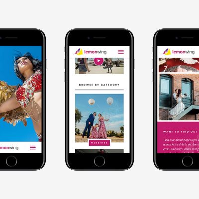
The website was all about showing off Lemon Wing’s photography, and of course being easy to navigate said photography, for instance through breaking up their different types into categories and highlighting these categories on the homepage. When it came to the galleries themselves, Amy wanted to make sure the images flooded the page, but in a tidy fashion, and this is where a masonry display for the image thumbnails came into play, along with going full-width. We also learned how to use a new WordPress header plugin for this site, to meet a somewhat unique objective with the header positioning throughout the site, as well as some other neat features.
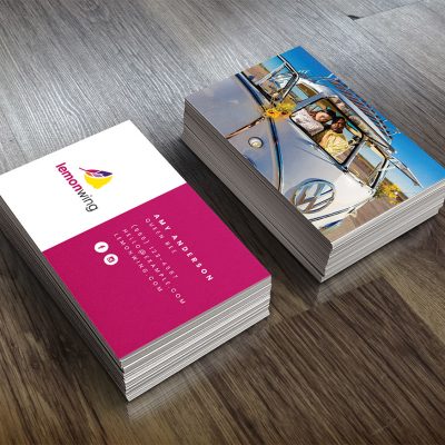
All other branding played out fairly straightforwardly. For the business cards, we set them up for one side to be one of Amy’s photos (one of Amy’s genius creative ideas), and for her Facebook cover art, one of her photos served as the perfect backdrop for incorporating her logo and tagline, leaving her profile image as her friendly face per her request. This was a S’more Brands project which means we worked with Amy in real time; I’m pretty sure her positive energy added a lot to the final outcome of her branding!
Role(s): design; development assistance
Homepage

Details
Client
Lemon Wing
Agency
S'more Brands
Creative Director
N/A


